ATB FINANCIAL BRAND DIRECTION
Change making.
When I became Creative Director at ATB Financial, our branding was inconsistent, and the work inefficient. We served multiple divisions, most using legacy designs and processes. Few templates and systems were in use. The in-house team was often used as production resource, and their expertise underutilized.
The goal: increase brand consistency, and by extension, brand attribution and ad effectiveness. Improving processes and methodology would create faster turnarounds, essential for increasing digital marketing needs. ‘Automating’ day-to-day work would let marketers focus on strategy and free creatives to focus on, well, being creative (and to be home for dinner).

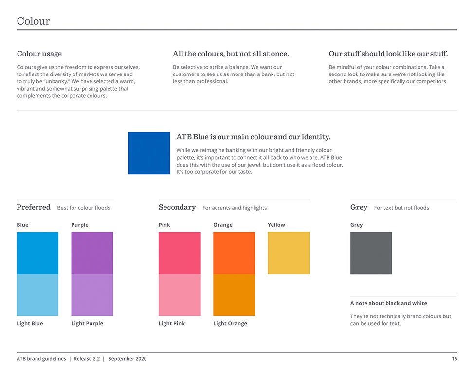
After completing a brand audit came a short design exploration. This identified the need for simple graphic devices and more defined colour guidelines.
The exercise showed senior leadership “less popular” colours like pink and orange still served a valuable function, and that we should maintain our existing palette, with new usage parameters, until a rebranding.
Updated guidelines were socialized, including presentations to contract designers and external vendors. ATB ads and brand materials rapidly became more consistent. Reducing brand design elements actually inspired more innovative, thoughtful solutions.


Never let a good pandemic go to waste.
Winston Churchill, sorta.
ATB, like others, reacted quickly to the Covid-19 pandemic. This sudden shift created both challenges and opportunities—including proactive departmental improvements.
Strategies were defined and socialized. Existing processes were streamlined and new systems created. Templates were implemented, standards refined and applied, and workflows improved, all while meeting urgent marketing needs.
Together, we will get through this. See how.
The initial reaction was to develop a radio ad; a message from our CEO. We presented this with the recommendation to pause and consider customer needs.
After quick testing we came back with the more thorough strategy, and new script, shown below.


Get Albertans what they need.
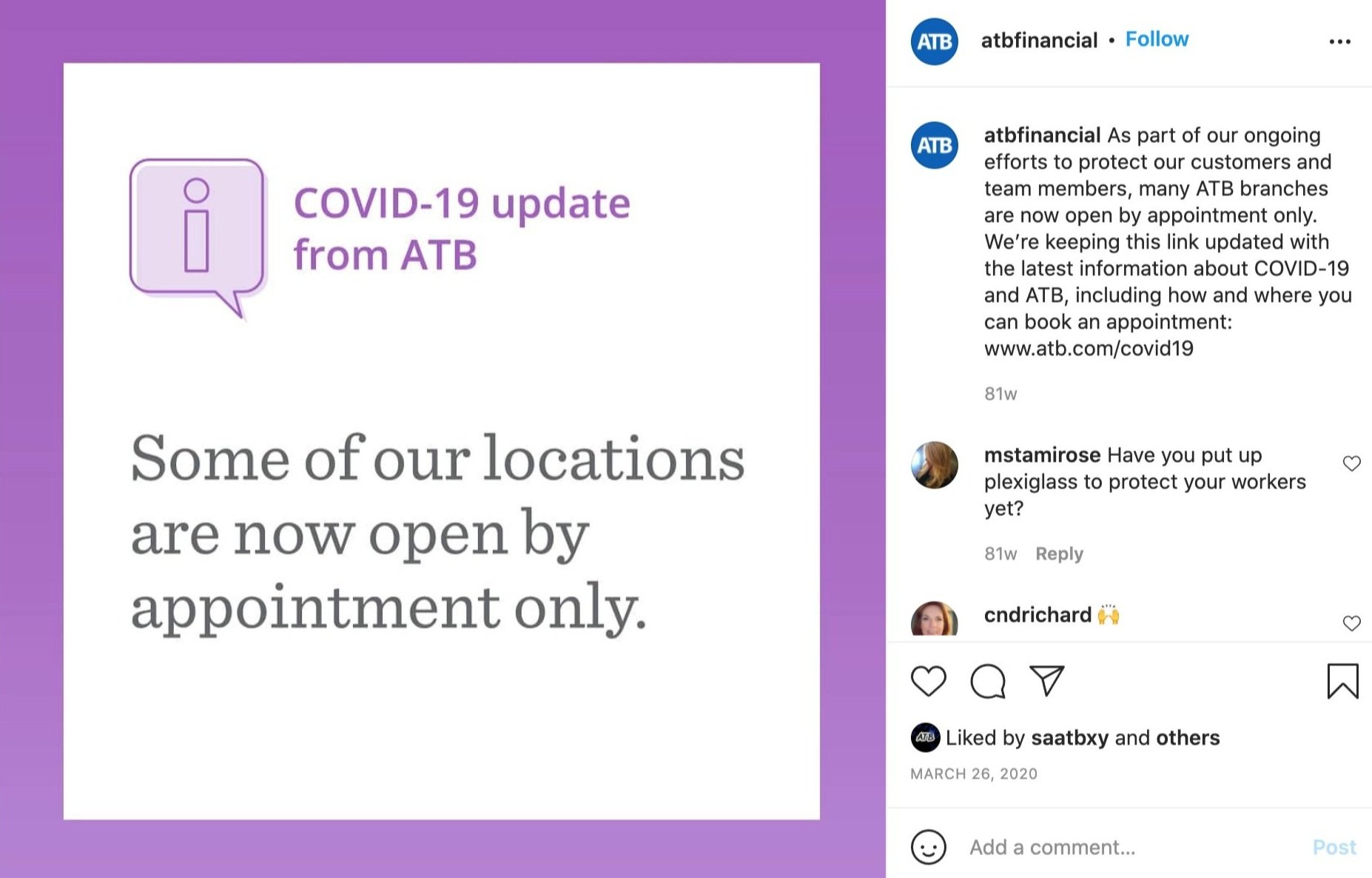
We rapidly launched a digital campaign that drove to a site with urgent information. Templates, designed to stand out but not alarm, and a workflow process new to ATB at the time allowed for rapid-response messaging updates. Images were pre-approved for anticipated subjects.
Community support initiatives continued this urgent-but-friendly design system, giving ATB a much-needed, consistent market presence.


A year behind us, another ahead.
Our Annual Report was in progress as the pandemic began. We proposed a shift in both message and approach: Reflect on how the prior year prepared ATB for the challenging days ahead, and to free-up resources, simplify the online AR to a single ‘hero’ image and graphic textures. The image, and the story it tells, are a collaboration by Edmonton artist Jeff Sylvester.


Locked down.
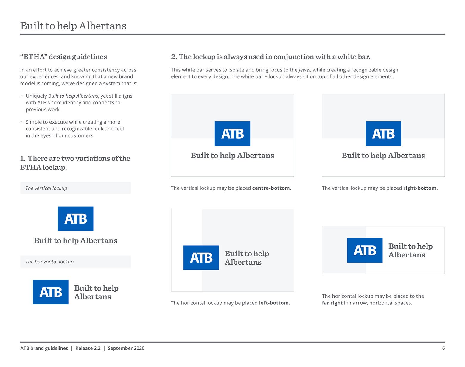
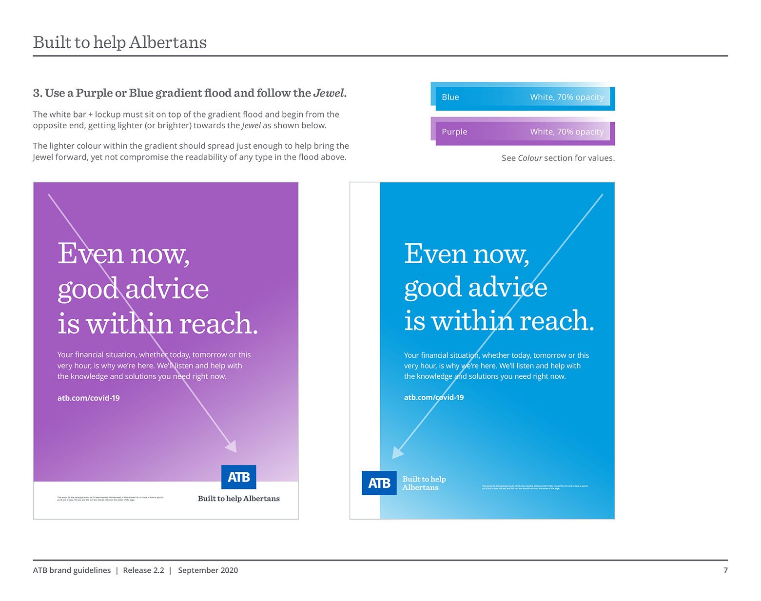
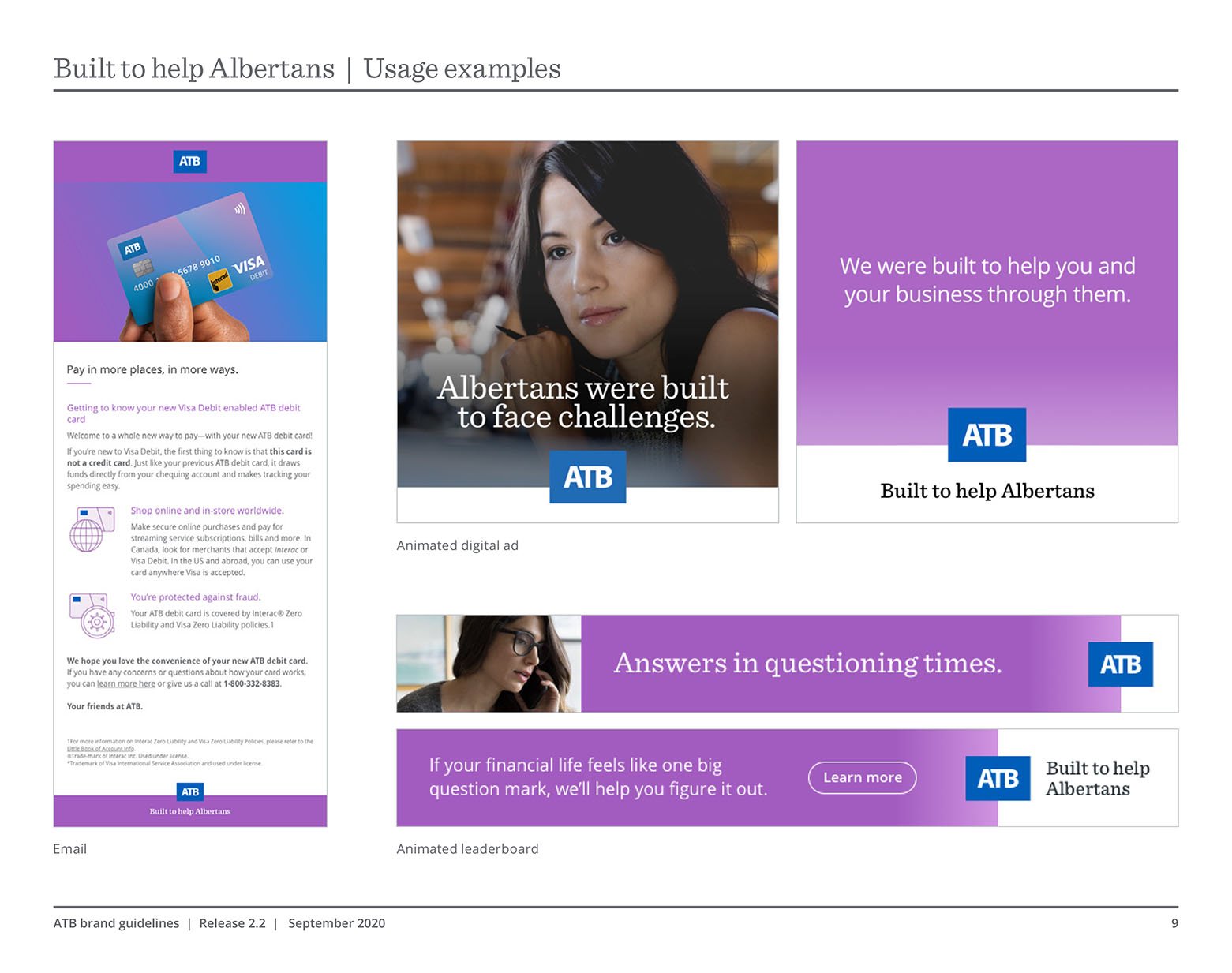
After meeting immediate Covid needs, it became clear that a more intentional brand strategy was needed for the ever-changing, ongoing phases of the pandemic, and beyond. We developed Built to Help Albertans.
While the creative team locked-down a design system, I defined and socialized the thinking—including when the strategy should not be applied.
We further refined the process for digital ads. An entire messaging wave was now contained in a single spreadsheet, from ask, to copy and image proofs, up to executing banner ad files.


Work less, but work better.
Another benefit of this work: more effective outsourcing of day-to-day design and execution. We improved our roster of design contractors, along with briefing and oversight policies.
We were able to move the in-house team’s attention away from fires towards focussed creative thinking and projects where an intimate understanding of ATB was essential. We launched a new corporate purpose, innovated within the brand, and further established ourselves as strategic partners and creative experts.
In 2020 ATB replaced their beloved corporate Story with a new Purpose statement. This video launched this new direction while acknowledging the previous ‘brand story’ and its typeset Alberta shape.


Looking like ourselves.
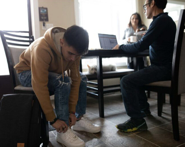
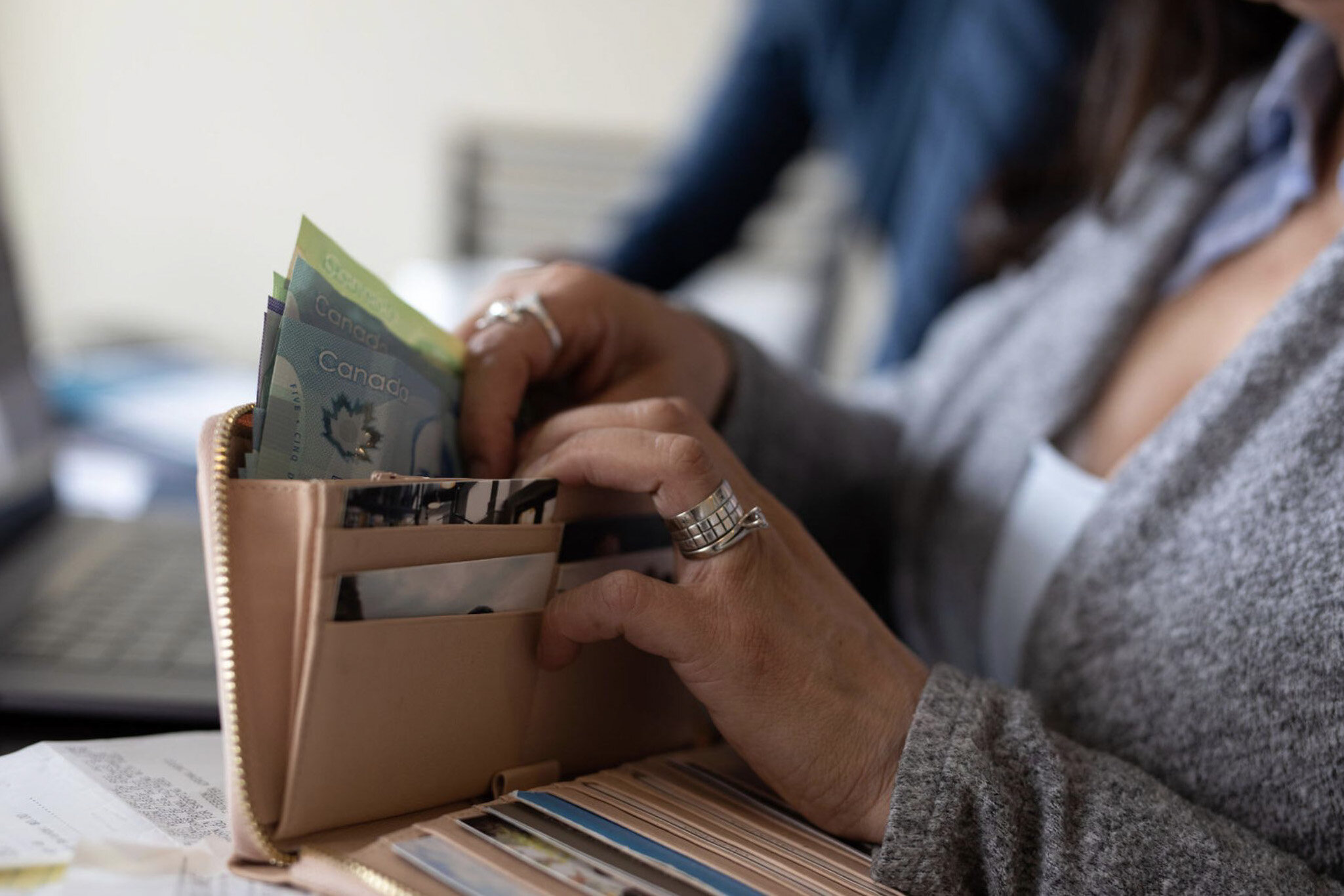
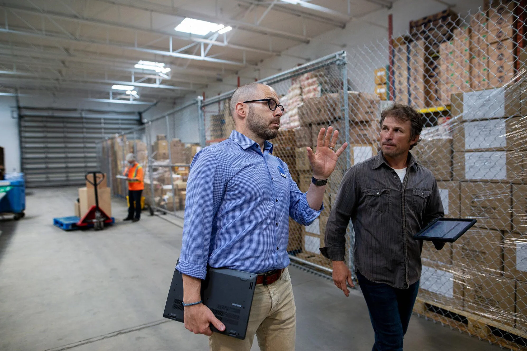
ATB developed our own photo and video library, an investment in brand recognition and increased efficiency. A content proposal was developed based on our unique needs, our brand vision, and where we found existing stock failed us.
In partnership with Hero Images, we made an on-brand visual library with incredible authenticity and diversity—expressions and poses people actually make while banking, on faces and in homes, and our own branches, that reflect our Alberta.